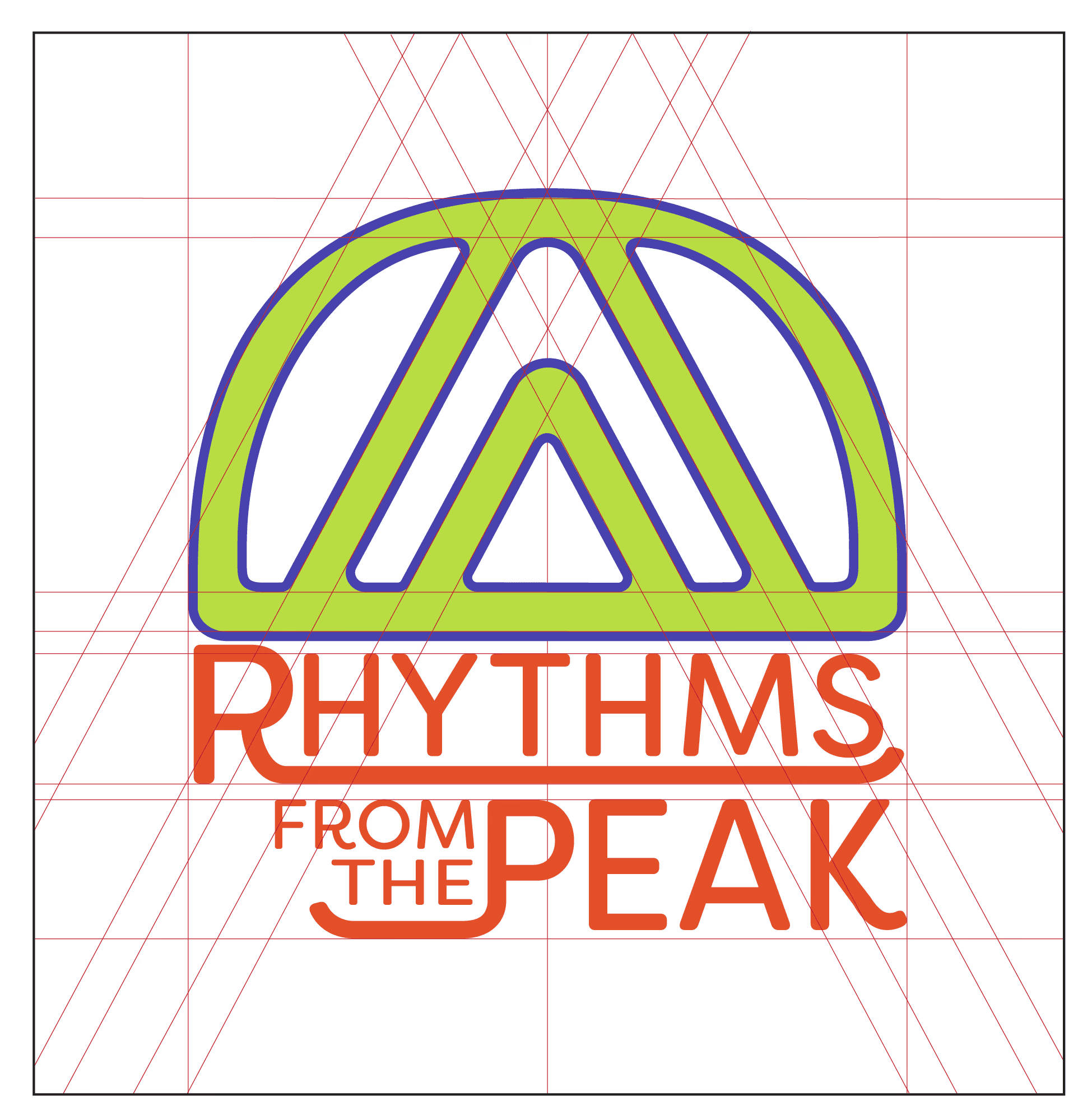
RHYTHMS FROM THE PEAK
RHYTHMS FROM THE PEAK
Conceptual branding system for a fictional music festival.
Conceptual branding system for a fictional music festival.
The project challenged me to create a cohesive brand by combining two contrasting genres:
The project challenged me to create a cohesive brand by combining two contrasting genres:
Japanese Rap
Japanese Rap
Psychedelic Rock
Psychedelic Rock
The goal was to invent the festival’s name, identity, and visual system, and apply it across digital, print, and physical touchpoints.
The goal was to invent the festival’s name, identity, and visual system, and apply it across digital, print, and physical touchpoints.

DEFINE
DEFINE
The brand needed to merge two distinct musical cultures into a unified, recognizable identity.
The brand needed to merge two distinct musical cultures into a unified, recognizable identity.
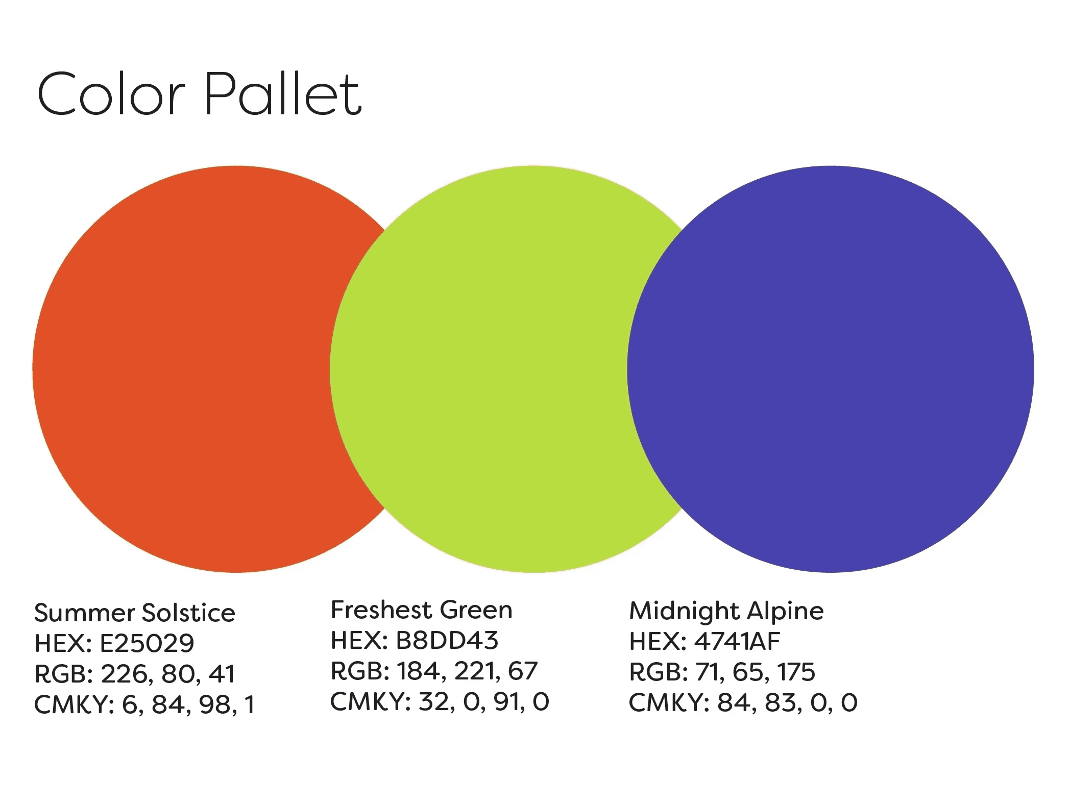
Design Principles:
Design Principles:
Logo and typography work cohesively, but remain strong independently
Logo and typography work cohesively, but remain strong independently
Rounded, expressive forms without sacrificing legibility
Rounded, expressive forms without sacrificing legibility
Minimal and scalable for diverse applications
Minimal and scalable for diverse applications
Energetic and vibrant, without visual overload
Energetic and vibrant, without visual overload
IDEATE
IDEATE
Finding overlap between the two genres was initially challenging. Through mind mapping, several shared themes and symbolic elements emerged. These ideas informed the festival name and visual direction:
Finding overlap between the two genres was initially challenging. Through mind mapping, several shared themes and symbolic elements emerged. These ideas informed the festival name and visual direction:
Key Concepts:
Key Concepts:
Rhythms, reflects the foundation of all music
Rhythms, reflects the foundation of all music
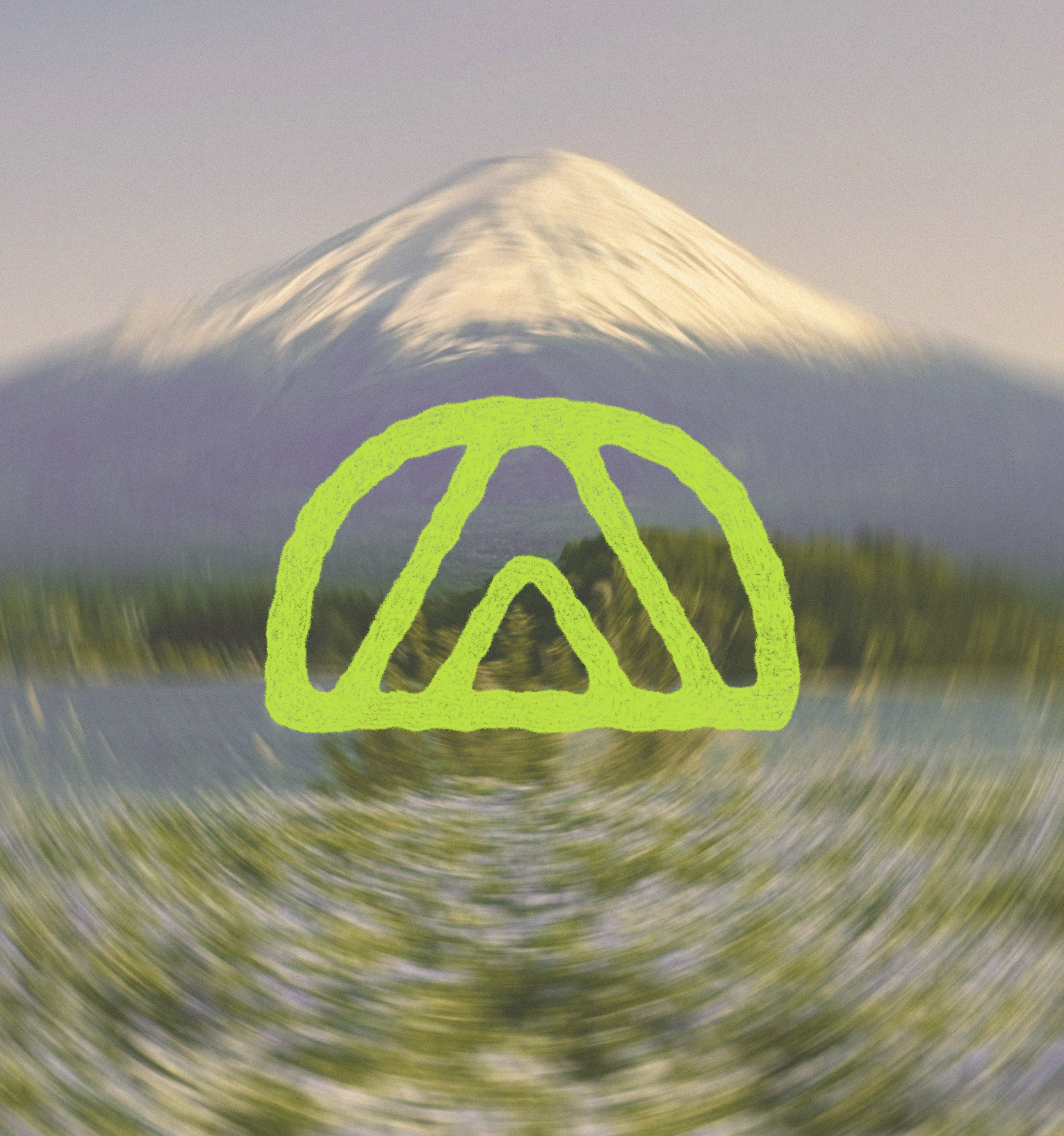
Peak, references Mt. Fuji and subtly alludes to the psychedelic experience
Peak, references Mt. Fuji and subtly alludes to the psychedelic experience
Peace, an icon of the psychedelic counterculture
Peace, an icon of the psychedelic counterculture
Mountains, referencing mt. Fuji and Japanese Culture
Mountains, referencing mt. Fuji and Japanese Culture

PROTOTYPE
PROTOTYPE
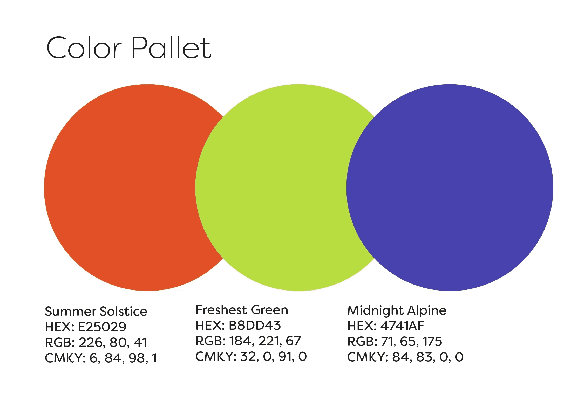
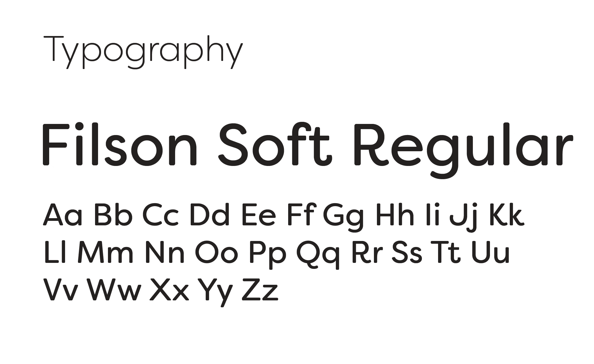
I tested variations in typography, logo construction, and color palettes to evaluate scalability and tone.
I tested variations in typography, logo construction, and color palettes to evaluate scalability and tone.
Peer critiques and instructor feedback guided refinement, with a focus on:
Peer critiques and instructor feedback guided refinement, with a focus on:
Optical balance and symmetry
Optical balance and symmetry
Consistent spacing and angles
Consistent spacing and angles
Improved legibility at multiple sizes
Improved legibility at multiple sizes
The final mark balances organic curves with geometric structure, reinforcing both harmony and contrast.
The final mark balances organic curves with geometric structure, reinforcing both harmony and contrast.
IMPLEMENT
IMPLEMENT
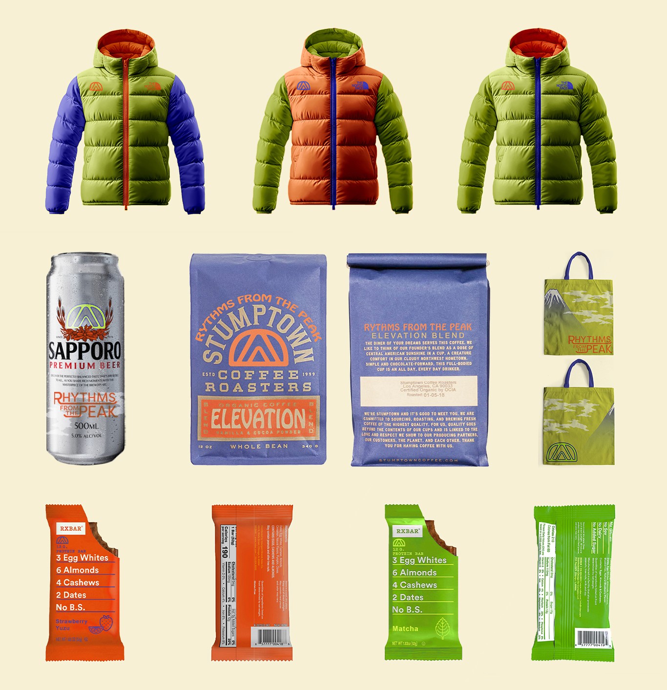
Products
With the core identity finalized, I applied the brand across festival-ready touchpoints. All items were selected for practical, real-world festival use.
With the core identity finalized, I applied the brand across festival-ready touchpoints. All items were selected for practical, real-world festival use.
Branded applications included:
Branded applications included:
Outerwear and accessories
Outerwear and accessories
Beverage and food packaging
Beverage and food packaging
Promotional materials
Promotional materials
IMPLEMENT
IMPLEMENT
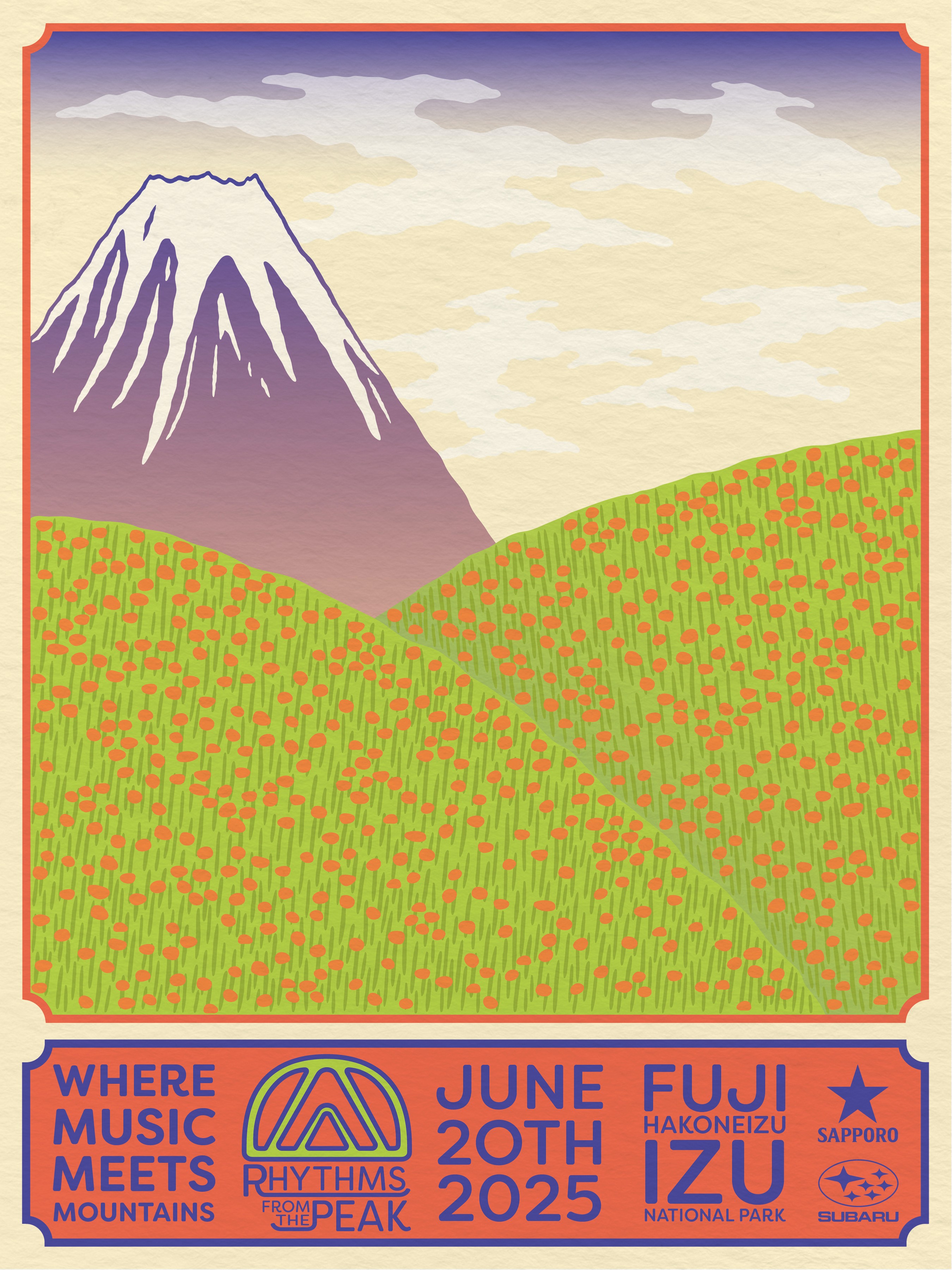
Poster
The final deliverable was a promotional poster. I found inspiration from traditional Japanese woodblock prints and National Park poster designs.
The final deliverable was a promotional poster. I found inspiration from traditional Japanese woodblock prints and National Park poster designs.
Visual characteristics the guided the design were:
Visual characteristics the guided the design were:
Flat shapes and muted solids
Flat shapes and muted solids
Textural Depth
Textural Depth
Asymmetry
Asymmetry
Large central illustration with minimal supporting text
Large central illustration with minimal supporting text
The brief did not include creating a fictional lineup, so the poster emphasizes location and atmosphere as the primary focal point.
The brief did not include creating a fictional lineup, so the poster emphasizes location and atmosphere as the primary focal point.
Conceptual branding system for a fictional music festival.
RHYTHMS FROM THE PEAK
The project challenged me to create a cohesive brand by combining two contrasting genres:
Japanese Rap
Psychedelic Rock
The goal was to invent the festival’s name, identity, and visual system, and apply it across digital, print, and physical touchpoints.
DEFINE
The brand needed to merge two distinct musical cultures into a unified, recognizable identity.
Design Principles:
Logo and typography work cohesively, but remain strong independently
Rounded, expressive forms without sacrificing legibility
Minimal and scalable for diverse applications
Energetic and vibrant, without visual overload
IDEATE
Finding overlap between the two genres was initially challenging. Through mind mapping, several shared themes and symbolic elements emerged. These ideas informed the festival name and visual direction:
Key Concepts:
Rhythms, reflects the foundation of all music
Peak, references Mt. Fuji and subtly alludes to the psychedelic experience
Peace, an icon of the psychedelic counterculture
Mountains, referencing mt. Fuji and Japanese Culture
PROTOTYPE
I tested variations in typography, logo construction, and color palettes to evaluate scalability and tone.
Peer critiques and instructor feedback guided refinement, with a focus on:
Optical balance and symmetry
Consistent spacing and angles
Improved legibility at multiple sizes
The final mark balances organic curves with geometric structure, reinforcing both harmony and contrast.
IMPLEMENT
With the core identity finalized, I applied the brand across festival-ready touchpoints. All items were selected for practical, real-world festival use.
Branded applications included:
Outerwear and accessories
Beverage and food packaging
Promotional materials
Products
IMPLEMENT
Poster
The final deliverable was a promotional poster. I found inspiration from traditional Japanese woodblock prints and National Park poster designs.
Visual characteristics the guided the design were:
Flat shapes and muted solids
Textural Depth
Asymmetry
Large central illustration with minimal supporting text
The brief did not include creating a fictional lineup, so the poster emphasizes location and atmosphere as the primary focal point.